Light & Stage
How Warm Lighting Changes Color and Texture
Angle, intensity and color relationship can reveal relief or flatten it; controlled tests show what a surface will actually do on stage.
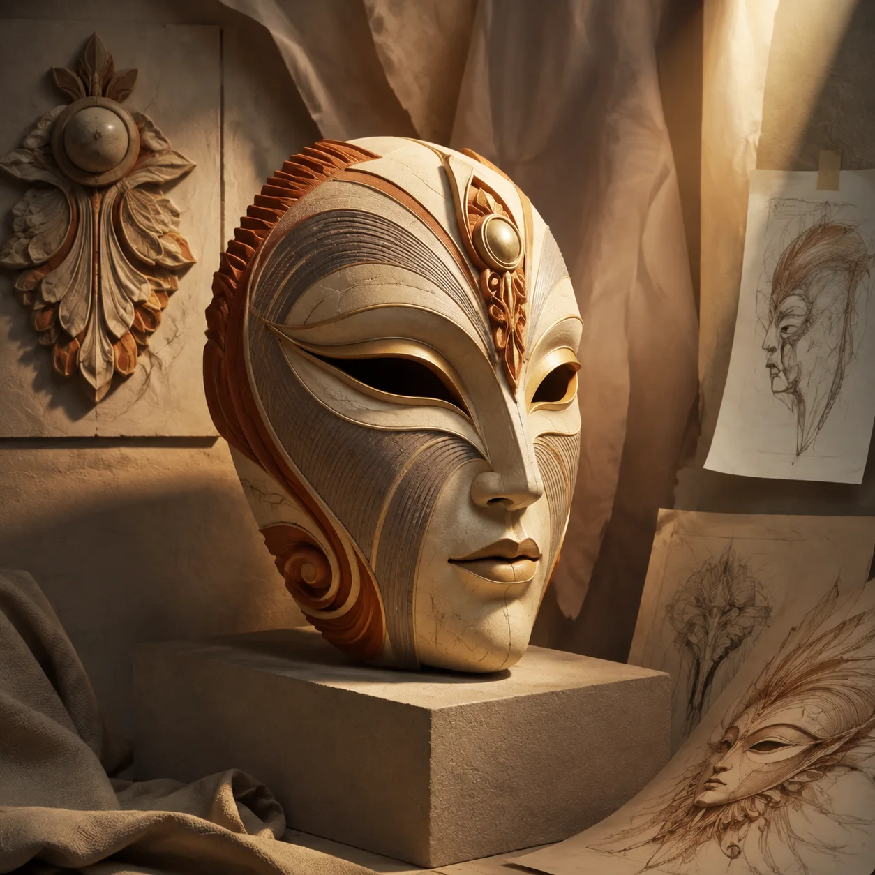
Warm light does not simply “make an image dramatic.” It changes the relationship between highlights, mid-tones and shadows, and it can shift how painted colors appear beside one another. On a ridged mask, shallow side light may reveal grooves that frontal light suppresses. These effects are design variables. They do not produce one guaranteed emotion, and they should be evaluated in the real venue whenever a physical production is involved.
Separate color from value
First view the test image in grayscale. If the eye openings, brow and outer edge merge, adding more orange will not restore their structure. Adjust brightness relationships so the focal planes separate, then return to color. A small pale highlight beside a deep graphite shadow can carry more form than a large field of saturation.
The National Gallery of Art’s color materials encourage readers to compare how light and surrounding conditions affect a subject. For design work, that close-looking habit matters more than a fixed chart of emotional meanings. Record the fixture, angle and sample because a verbal label such as “warm” is not precise enough to repeat a test.
Let angle describe relief
Light close to the viewing direction fills recesses and reduces cast shadow. Light from the side creates longer transitions across raised lines. Neither is inherently better: frontal light may clarify painted graphics, while side light may reveal sculptural depth.
Rotate the sample rather than judging one view. A highlight that outlines the left cheek can disappear when the performer turns. Back or rim light may separate the silhouette from scenery but leave the face unreadable. Build a cue around the action, not around one still photograph.
Control reflective accents
Copper- or gold-colored details attract attention because they often carry sharper highlights than a matte field. Use them to mark the central motif or eye line, then reduce reflectivity elsewhere. If every groove shines, the face becomes a scattering of points and the major planes disappear.
Our stage-light illustration exaggerates this contrast to teach the idea. It shows an imagined mask on an imagined plinth with paper sketches. It is digital concept art, not evidence that a fabricated object will respond in exactly the same way. The caption keeps the distinction visible.
Build a repeatable test
Photograph the same sample under a neutral reference, the proposed warm cue and a contrasting cooler cue. Lock exposure where possible and include a note about distance and angle. The University of Maryland lighting-design repository record lists concept research, plots, hook-ups, cue documentation and production photographs—evidence that a lighting design is a system, not a single color choice.
A small publication cannot replace the production electrician, venue rules or designer’s technical paperwork. It can, however, show the logic clearly: define the focal plane, control the dark range, test reflective materials and document the conditions. That process turns “make it warmer” into a decision another collaborator can understand.
Working takeaway
Design warm light through value, angle and reflectivity, then verify the result on the actual surface and in the actual performance space.
Sources and scope
These references support the historical, collection and design framework. They do not endorse this publication or its illustrations.
- National Gallery of ArtThe Elements of Art
A museum teaching framework for discussing color, line, shape, form and texture as observable visual elements.
- University of MarylandLighting Design of Am I Black Enough, Yet?
A university repository record describing the research images, plot, cue track and production documentation used in a lighting-design thesis.